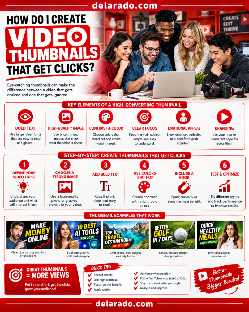
Video thumbnails get more clicks when they make one clear promise that matches the title and the actual video. The strongest thumbnails are simple, readable on a phone, visually specific, emotionally clear, and designed to make the right viewer curious enough to watch.
Do not optimize only for clicks. A misleading thumbnail may increase initial clicks but harm trust, retention, and channel performance. Your thumbnail should accurately represent the video and set the correct expectation for what viewers will receive.
YouTube defines click-through rate, or CTR, as the percentage of viewers who click after seeing a video impression. For example, if 1,000 people see a thumbnail and title and 100 click, the CTR is 10%. [1134]
What Makes a Thumbnail Clickable?
A thumbnail should answer one question quickly: “Why should I watch this video instead of the others around it?”
Strong Thumbnails Usually Have:
- One clear topic
- One primary visual focus
- Readable text, if text is used
- High contrast
- A visual that matches the title
- A recognizable person, product, object, or result
- Enough curiosity to earn attention
- An honest promise that the video delivers
- Brand consistency without visual clutter
- Mobile-first readability
Weak Thumbnails Often Have:
- Too much text
- Several unrelated images
- Tiny fonts
- Low contrast
- Generic stock imagery
- Unclear subject matter
- Misleading before-and-after claims
- Exaggerated results not shown in the video
- Too many arrows, circles, emojis, and effects
- Details that disappear on mobile
Thumbnail and Title Work Together
Your thumbnail and title should work as a pair. The title provides context; the thumbnail adds a visual reason to click. Do not repeat the exact same words in both unless the repetition improves clarity.
Example: Weak Pair
Title: How to Choose WordPress Hosting
Thumbnail text: How to Choose WordPress Hosting
This repeats the same message without adding visual interest or a reason to click.
Example: Stronger Pair
Title: How to Choose WordPress Hosting for a New Website
Thumbnail text: 3 Things to Check
The title explains the topic, while the thumbnail introduces a focused benefit and encourages the viewer to discover the three comparison points.
Another Example
Title: I Tested 7 AI Video Tools for Beginners
Thumbnail text: Which One Wins?
The thumbnail should show the relevant tool category, a meaningful reaction or comparison visual, and no unsupported claim about the result.
Start With the Video Promise
Before you design a thumbnail, write the video’s core promise in one sentence. The thumbnail should visualize that promise—not every point in the video.
Core-Promise Examples
- Help beginners compare WordPress hosting options.
- Show how to turn one blog post into five social posts.
- Explain the three mistakes that make thumbnails hard to read.
- Demonstrate how to create captions in CapCut.
- Compare the most useful AI video tools for short-form content.
- Show a simple workflow for planning a website launch.
Thumbnail Question
What single image, expression, object, contrast, or short phrase would make the right viewer understand this promise immediately?
A thumbnail does not need to explain the entire video. It needs to create a clear, accurate reason to begin watching.
Use One Main Visual Focus
Most thumbnails are viewed very small in a feed. Give the viewer one main visual subject instead of asking them to decode a collage of unrelated details.
Good Primary Subjects
- A close-up face with a relevant expression
- A clear product image
- A before-and-after comparison that is real and supportable
- A readable checklist
- A recognizable software screen
- A large visual result
- A simple diagram
- A single object connected to the topic
- An original photo showing the task
- A clear text-based concept
Example
For a tutorial called “How to Create Captions in CapCut,” use a clean screenshot of the caption timeline or an editor screen, a large “Auto Captions” label, and perhaps a simple arrow pointing to the relevant feature.
Do not add unrelated laptops, random stock people, multiple logos, decorative charts, and excessive text simply to fill the canvas.
Design for Mobile First
Many people discover videos on small screens. A thumbnail that looks detailed and impressive on a desktop may become unreadable on a phone.
Mobile-First Design Rules
- Use large text
- Use short phrases
- Use bold readable fonts
- Use high contrast between text and background
- Keep one main image
- Remove unnecessary decoration
- Make faces or products large enough to recognize
- Keep important details away from corners
- Preview at a small size before publishing
- Check the thumbnail in a mobile feed if possible
Simple Test
Zoom out until your thumbnail is about the size it will appear in a mobile feed. If you cannot identify the topic, read the text, and understand the visual focus in one or two seconds, simplify it.
Use Text Sparingly
Text can improve clarity, but too much text makes thumbnails difficult to read. Use a short phrase that adds something the title does not already explain.
Good Thumbnail Text Examples
- 3 Things to Check
- Do This First
- Beginner Mistakes
- Worth It?
- Before You Buy
- Simple Setup
- My Real Workflow
- Stop Doing This
- Best Free Option?
- What Changed?
Text to Avoid
- Long sentences
- Full video titles repeated word for word
- Small detailed lists
- Unsupported income claims
- False urgency
- Misleading “secret” claims
- Unreadable all-caps paragraphs
- Too many fonts
- Low-contrast text
Example
Video title: How I Use Canva to Plan a Month of Social Content
Thumbnail text: 30 Posts, 1 System
The thumbnail gives a concise result or framework while the title provides the full context.
Use Contrast to Stand Out
Contrast makes the main subject easier to notice quickly. It can come from color, brightness, shape, size, spacing, or visual simplicity.
Ways to Add Contrast
- Use dark text on a light background
- Use light text on a dark background
- Place a bright subject against a neutral background
- Use one accent color instead of many colors
- Add a subtle outline or shadow behind text
- Separate foreground from background
- Use whitespace around the main subject
- Increase brightness on the important object
- Darken distracting background areas
- Use color consistently with your brand
Contrast should improve readability, not turn every thumbnail into a bright, chaotic collection of neon colors and effects.
Use Faces Carefully
A recognizable face can make a thumbnail feel more human, especially when the person’s expression matches the video topic. However, faces are not required for every channel or video.
Faces Can Work Well For:
- Personal brand videos
- Reactions
- Reviews
- Challenges
- Personal stories
- Expert tutorials
- Interviews
- Announcements
Faces May Be Less Useful For:
- Software tutorials
- Screen-recorded walkthroughs
- Product close-ups
- Technical demonstrations
- Data-focused explainers
- Design showcases
- Faceless educational channels
Face Guidelines
- Use real photos you own or are authorized to use
- Use an expression that fits the topic
- Keep the face large enough to recognize
- Do not use misleading shocked expressions for ordinary content
- Do not manipulate someone’s image to imply an endorsement
- Do not use AI-generated people as fake customers or experts
A face should add clarity or emotional context. It should not be included merely because many popular thumbnails use faces.
Show a Real Result When Possible
A visual outcome can be compelling when it is real, relevant, and shown honestly. Examples include a completed design, an edited video timeline, a working website section, a finished project, or a real product in use.
Honest Result Examples
- A real Canva content calendar
- A real CapCut caption timeline
- A real WordPress setup screen
- A finished presentation slide
- A real product photo
- A real before-and-after design improvement
- A completed checklist
- A real analytics graph with sensitive data removed
Results to Avoid Faking
- Fake income screenshots
- Fake rankings
- Fake subscriber counts
- Fake product reviews
- Fake customer messages
- Fabricated health or beauty results
- AI-generated software dashboards presented as real
- False before-and-after comparisons
If a visual result requires important context, explain that context in the video rather than using a thumbnail that makes an unsupported promise.
Make Curiosity Honest
Curiosity is useful when it leads viewers to an answer that the video genuinely provides. It becomes clickbait when the thumbnail or title promises a result, reveal, event, or fact that the video does not deliver.
Honest Curiosity Examples
- Which option is better for beginners?
- What happened after testing this workflow?
- Why is this setting important?
- What do most beginners miss?
- Which feature should you compare first?
- Can this tool save editing time?
Misleading Curiosity Examples
- You Will Not Believe This
- Make $10,000 Today
- This Secret Makes You Rich
- Guaranteed Number One Ranking
- This One Trick Changes Everything
- Doctors Hate This
YouTube’s policy prohibits misleading thumbnails that make viewers think they are about to watch something that is not actually in the video. [1291][1298]
Use Brand Consistency Without Sameness
Consistent brand elements can help returning viewers recognize your videos. But every thumbnail should still communicate a distinct topic and visual reason to click.
Keep Consistent:
- One or two fonts
- Brand colors
- Text treatment
- Logo placement, if used
- Photo editing style
- Illustration style
- Visual framing
- Thumbnail tone
Change for Each Video:
- The main visual subject
- The headline phrase
- The key object or screenshot
- The color emphasis
- The specific outcome
- The visual story
Example
A channel may consistently use navy text, a yellow accent, and a clean sans-serif font. One thumbnail shows a CapCut timeline, another shows a WordPress dashboard, and another shows a Canva carousel—each with a different clear promise.
Step-by-Step Thumbnail Workflow
Step 1: Write the Video’s Main Promise
Write one sentence describing what the right viewer will gain after watching the video.
Examples
- Learn the three factors that matter most when comparing WordPress hosting.
- See a beginner workflow for creating captions in CapCut.
- Choose an AI image tool based on commercial-use needs.
- Turn one blog post into a short video using a simple process.
This promise becomes the basis for your title and thumbnail.
Step 2: Choose One Thumbnail Angle
Pick the most compelling honest angle rather than trying to include every lesson from the video.
Useful Thumbnail Angles
- A problem to avoid
- A result to understand
- A comparison
- A surprising finding
- A beginner mistake
- A simple process
- A real example
- A useful checklist
- A before-and-after improvement
- A tool or feature demonstration
Example
Video topic: How to Choose WordPress Hosting
Possible angle: “3 Things to Check Before You Buy”
This is more visually focused than trying to list support, backups, uptime, performance, pricing, domains, and every hosting feature in the thumbnail.
Step 3: Sketch Three Concepts
Before opening a design tool, outline three different thumbnail concepts. This helps prevent you from accepting the first generic idea.
Concept Example: Hosting Video
| Concept | Main Visual | Text |
|---|---|---|
| Checklist | Large checklist with hosting-related icons | 3 Things to Check |
| Comparison | Two generic hosting-plan cards with a question mark | Before You Buy |
| Mistake | Website icon beside warning symbol | Don’t Make This Mistake |
Choose the concept that best matches what the video actually delivers and makes the intended audience curious.
Step 4: Gather Approved Assets
Use original photos, screenshots, product images, design elements, icons, licensed stock assets, or authorized AI illustrations.
Appropriate Thumbnail Assets
- Your own photos
- Your own screenshots
- Your own product images
- Your own illustrations
- Licensed stock images
- Authorized client assets
- Approved brand graphics
- AI illustrations clearly used as illustration
Assets to Avoid
- Celebrity images without permission
- Competitor logos used misleadingly
- Customer photos without consent
- Fake product interfaces
- Fake analytics screenshots
- AI-generated fake customers
- Copied thumbnail designs
- Unlicensed images found through web search
Use a visual asset only if it is relevant, authorized, and does not create a false impression about the video or your business.
Step 5: Build the Layout
Place the main subject first, then add short text only if it improves clarity. Keep backgrounds simple so the subject and text remain visible.
Basic Layout Options
- Face on one side, text on the other
- Product or software screenshot on one side, text on the other
- Large centered object with short top text
- Before-and-after split screen
- Checklist with one large supporting icon
- Close-up object with a simple question
Layout Checklist
- Is there one obvious subject?
- Can the text be read at a small size?
- Does the background compete with the subject?
- Is there enough contrast?
- Does the layout match the video topic?
- Are important details safely inside the crop?
- Is the design clear without the title?
Step 6: Export at the Right Size
Use a high-resolution image in a 16:9 layout so the thumbnail remains clear across devices. YouTube commonly supports custom thumbnails in a 16:9 format, and many creator workflows use 1280 × 720 pixels as a practical design size.
Export Checklist
- Use a 16:9 aspect ratio
- Use a high-resolution image
- Check current file-size requirements
- Use a supported image format
- Make sure text is crisp
- Check colors after export
- Preview on desktop and mobile
Design guidance commonly uses 1280 × 720 pixels for YouTube thumbnails, while YouTube’s current requirements and upload limits should always be checked before publishing. [1294][1300]
Step 7: Test the Thumbnail
Do not guess which thumbnail will work best. Create two or three concepts and test them when your platform offers a comparison feature.
YouTube Thumbnail Test & Compare
YouTube’s Thumbnail Test & Compare feature allows eligible creators to upload up to three thumbnail variations and test them with viewers to identify a stronger option. [1290]
What to Test
- Different text phrases
- Face versus no face
- Different background colors
- Checklist versus comparison layout
- Different product screenshots
- Different visual outcomes
- Different levels of text detail
Test One Major Difference at a Time
If every element changes between versions, it is harder to learn what influenced the result. For example, test “3 Things to Check” against “Before You Buy” while keeping the same core visual.
Step 8: Review CTR With Retention
CTR shows whether viewers chose to click after seeing the title and thumbnail. But a high CTR alone does not mean the thumbnail is successful.
Review Together:
- Impressions
- Click-through rate
- Average view duration
- Audience retention
- Watch time
- Comments
- Shares
- Subscribers gained
- Website clicks
- Conversions tied to the video goal
How to Interpret Results
| Pattern | Possible Meaning | What to Review |
|---|---|---|
| Low CTR, good retention | The video may be valuable, but the packaging is not compelling enough. | Test a clearer title, stronger contrast, or more specific thumbnail promise. |
| High CTR, poor retention | The title or thumbnail may promise more than the video delivers, or the opening is weak. | Align the first 30 seconds with the thumbnail promise and remove misleading framing. |
| Low CTR, poor retention | The topic, packaging, opening, or video quality may need improvement. | Review the audience need, video structure, thumbnail clarity, and hook. |
| Strong CTR, strong retention | The thumbnail, title, and video are likely aligned with viewer expectations. | Study the format and apply its principles—not a copied design—to related videos. |
YouTube explains that CTR measures how often viewers click after seeing a video’s title and thumbnail as an impression. [1134]
Thumbnail Ideas by Video Type
How-To Tutorials
- Show the finished result
- Show the relevant software screen
- Use one short action phrase
- Highlight the key step or setting
- Use a clear before-and-after only if it is real
Product Reviews
- Use a real product image
- Show a clear verdict question
- Use a side-by-side comparison if relevant
- Show the tested product in real use
- Avoid fake ratings or fake customer claims
List Videos
- Use a large number
- Show one or two representative items
- Keep the list concept simple
- Use text such as “5 Tools” or “3 Mistakes”
- Make sure the video actually contains the listed items
Comparison Videos
- Use a clear side-by-side layout
- Show the relevant products or tools
- Use “Which Is Better?” or “Best for Beginners?”
- Avoid implying a winner that the video does not support
- Use real screenshots and accurate branding where authorized
Personal Brand Videos
- Use an expressive but relevant photo
- Show the real setting or object involved
- Use a personal but honest headline
- Keep the background simple
- Match the emotion of the actual story
Faceless Educational Videos
- Use a checklist or diagram
- Use a relevant software screenshot
- Show a clear process visual
- Use one large concept icon
- Use branded illustration styles consistently
Tools for Thumbnail Design
Canva
Canva can help create thumbnail layouts, add brand colors, use templates, place screenshots, add text, create simple graphics, and export images for video platforms.
Adobe Express
Adobe Express can help create branded thumbnails, remove backgrounds, add text, resize graphics, and build reusable visual templates.
Photoshop
Photoshop can help with detailed image editing, color correction, photo compositing, background removal, retouching, masking, and more advanced thumbnail production.
Figma
Figma can help create thumbnail systems, reusable components, team workflows, content templates, and shared brand design libraries.
YouTube Studio
YouTube Studio can help upload thumbnails, review impressions and CTR, and use Thumbnail Test & Compare where available. The test feature supports up to three thumbnail variations. [1290]
Envato
Envato can provide licensed fonts, photos, icons, graphics, and thumbnail templates. Use each asset according to its current license and do not use stock images as false evidence of customers, results, locations, or products.
Common Thumbnail Mistakes
Trying to Explain Everything
A thumbnail should create one clear idea. Use the video, description, chapters, and captions to provide detail.
Using Tiny Text
If the text cannot be read at a small mobile size, remove words or make the text larger.
Repeating the Entire Title
Let the title provide full context. Use thumbnail text to add a short benefit, question, warning, comparison, or curiosity point.
Using Too Many Visual Elements
Remove unnecessary arrows, circles, screenshots, logos, product images, filters, and text. One clear visual focus is usually stronger.
Using Generic Stock Photos
Random laptop photos, business handshakes, and unrelated office scenes rarely communicate a specific reason to watch. Use real screenshots, original photos, relevant products, or clear illustrations instead.
Creating Misleading Clickbait
Do not use fake results, false urgency, unrelated celebrity images, exaggerated expressions, or promises that are not delivered in the video. YouTube prohibits misleading thumbnails and metadata. [1291][1298]
Using Fake Screenshots or Results
Do not create fake income dashboards, fake analytics, fake reviews, fake rankings, fake messages, or AI-generated interfaces presented as real.
Ignoring the First 30 Seconds
The opening of the video should immediately support the thumbnail and title promise. If viewers click and do not see what they expected, retention may drop.
Not Testing Alternatives
Create two or three concepts and compare them through YouTube’s testing feature when available rather than relying on personal preference alone. [1290]
Changing Too Many Variables
When testing thumbnails, change one major idea at a time so you can understand why one version performs better.
Frequently Asked Questions
What makes a video thumbnail get clicks?
A clickable thumbnail has one clear subject, readable design, strong contrast, an honest curiosity point, and a visual promise that matches the title and video content.
How much text should a thumbnail have?
Use as little text as needed to clarify the main idea—often a short phrase. The text should be large, high-contrast, and readable on a phone.
Should I put my face in every thumbnail?
No. Faces can help with personal-brand, reaction, review, and story-driven videos, but software tutorials, product demos, technical videos, and faceless explainers may perform better with a clear result, product, screenshot, or diagram.
What thumbnail size should I use for YouTube?
Use a high-resolution 16:9 thumbnail. Many creators design at 1280 × 720 pixels, but check YouTube’s current requirements and file limits before upload. [1294][1300]
What is a good YouTube click-through rate?
There is no universal good CTR because it varies by audience, traffic source, topic, channel size, and number of impressions. Compare each video against your channel’s own historical performance and review retention alongside CTR.
Can a high CTR be bad?
Yes. If a thumbnail earns clicks by making a promise the video does not deliver, viewers may leave quickly. A strong thumbnail should attract the right viewers and align with the opening and full content of the video.
Can I use AI-generated images in thumbnails?
Yes, if you have appropriate rights and the image is used honestly. Do not use realistic AI-generated people, products, results, news events, customer reviews, or screenshots in ways that viewers could mistake for real evidence.
Can I use stock images in thumbnails?
Yes, if you have a suitable license. Do not use stock people as fake customers or experts, stock locations as your office, or generic footage as proof of real product results.
How do I test YouTube thumbnails?
Where available, use YouTube Studio’s Thumbnail Test & Compare feature to upload up to three thumbnail options and compare them with viewers. Review the outcome alongside audience retention and watch time. [1290]
What thumbnails are not allowed on YouTube?
Do not use thumbnails that mislead viewers about what the video contains, including false claims, deceptive imagery, or unrelated content. YouTube’s policies prohibit misleading thumbnails and metadata. [1291][1298]