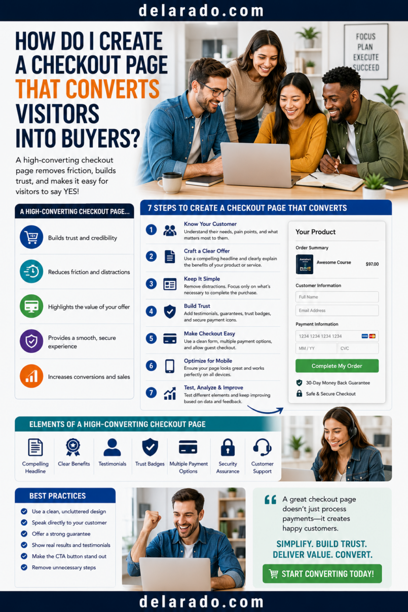
A checkout page converts visitors into buyers when it makes the purchase clear, simple, trustworthy, and easy to complete. Show the product, full price, delivery details, payment options, refund or cancellation information, and support contact clearly—then ask only for the information needed to complete the transaction.
The goal is not to pressure a visitor into buying. It is to remove unnecessary friction for people who have already decided that your product or service may be right for them. A clear checkout helps the customer understand exactly what they are purchasing and what happens after payment.
Baymard Institute identifies late unexpected costs, forced account creation, and overly complex checkout as common usability causes of abandonment. Its research notes that 39% of surveyed shoppers abandoned because of extra costs, while 19% cited mandatory account creation. [182][183]
Who Is This Topic For?
This guide is for eCommerce stores, course creators, digital-product sellers, WooCommerce businesses, Shopify sellers, coaches, consultants, membership owners, service providers, and anyone accepting online payments.
This Article Is Helpful If You Want To:
- Create a clearer checkout page
- Improve purchase completion
- Reduce checkout abandonment
- Sell digital products
- Sell courses or memberships
- Accept payments for services
- Improve mobile checkout
- Show pricing and fees clearly
- Offer guest checkout
- Track checkout performance
What Is a Checkout Page?
A checkout page is the part of an online purchase process where a customer confirms what they are buying, enters the details needed for payment and delivery, reviews the total, and completes the transaction.
Basic Checkout Flow
Product page → Add to cart or buy now → Checkout → Payment → Order confirmation → Product delivery or access
A Checkout Page May Include:
- Product name
- Product image or summary
- Quantity
- Price and currency
- Taxes, shipping, or fees
- Billing information
- Shipping information for physical products
- Payment options
- Delivery or access details
- Refund or cancellation policy
- Terms and privacy links
- Support contact information
- Purchase button
A checkout page should make it easy for a customer to answer four questions: What am I buying? How much will I pay? When and how will I receive it? What do I do if I need help?
What Makes a Checkout Page Convert?
A high-quality checkout page helps a willing buyer complete a purchase without confusion. It focuses on clarity, transparent pricing, relevant trust information, simple forms, and reliable technical performance.
Strong Checkout Pages Usually Have:
- Clear product name
- Accurate product description
- Visible price and currency
- Clear total before payment
- Transparent shipping, tax, or service fees
- Guest checkout option where appropriate
- Short, relevant forms
- Trusted payment options
- Clear delivery or access details
- Visible support information
- Refund or cancellation policy link
- Mobile-friendly design
- Minimal distractions
- Accessible form labels and error messages
Weak Checkout Pages Often Have:
- Unexpected fees at the final step
- Required account creation
- Long or unnecessary forms
- Hidden subscription terms
- Preselected paid add-ons
- Confusing pricing
- Unclear digital-product delivery
- Missing refund information
- Broken payment buttons
- Slow mobile performance
- Too many upsells or popups
- Fake urgency or misleading scarcity
Benefits of a Better Checkout
Helps More Interested Customers Complete Purchases
Removing unnecessary barriers can help people who already want the product complete payment without being confused or interrupted.
Builds Trust
Clear prices, visible policies, accurate delivery details, reliable payment options, and customer support information can help customers feel more confident about the purchase.
Reduces Support Requests
Clear answers about shipping, digital access, refunds, subscriptions, payment, and product details can reduce repetitive customer questions.
Improves Mobile Experience
A mobile-friendly checkout can help customers who shop from a phone complete forms, select payment options, review totals, and access confirmation information more easily.
Can Reduce Abandonment
Improving cost transparency, guest checkout, form length, error handling, payment options, and delivery clarity can reduce avoidable checkout drop-off.
Creates Better Data
Clear checkout stages can be tracked to show where customers leave, whether at cart, shipping, payment, or order confirmation.
Supports Long-Term Customer Relationships
A respectful and easy purchase process can make customers more likely to trust your business, use the product successfully, and consider future purchases.
Risks and Limitations
A Better Checkout Cannot Fix a Weak Offer
Checkout design cannot make an unclear, overpriced, unsuitable, low-quality, or misleading product valuable to customers.
Not Every Visitor Is Ready to Buy
Some people are comparing options, saving items for later, waiting for a budget, or just browsing. Do not assume all abandoned checkouts are caused by a page-design problem.
Too Much Optimization Can Create Pressure
Fake countdowns, false scarcity, misleading discounts, forced add-ons, preselected subscriptions, and guilt-based decline buttons can damage trust and create consumer-protection risk.
Technical Changes Can Create Errors
Changing payment settings, checkout fields, shipping rules, coupon behavior, plugins, page templates, or upsell logic can create new problems. Test every change.
Payment Processor Rules Still Apply
Payment providers may have separate requirements for digital products, refunds, subscriptions, fraud prevention, chargebacks, payout timing, and business eligibility.
Subscription Terms Need Extra Care
If checkout includes recurring billing, a trial conversion, automatic renewal, or payment plan, explain the material terms clearly and obtain appropriate informed consent before charging.
Accessibility Matters
A visually attractive page can still be difficult to use if forms lack labels, error messages are unclear, text contrast is poor, buttons are too small, or keyboard navigation does not work.
Step-by-Step Process
Step 1: Define the Checkout Goal
Every checkout page should support one main purchase. Do not make a customer choose among unrelated offers when they are trying to complete a transaction.
Possible Checkout Goals
- Sell one digital download
- Sell an online course
- Sell a membership
- Book a paid consultation
- Sell a physical product
- Sell a workshop ticket
- Start a software subscription
- Collect a deposit for a service
- Sell a template bundle
Example Goal
Sell the Website Launch Checklist Bundle for a one-time payment of $29 USD.
Keep the purchase goal clear. A checkout page should not make the customer wonder whether they are buying a bundle, joining a membership, booking a call, or signing up for a newsletter.
Step 2: Show the Product Clearly
At checkout, restate what the customer is buying. Do not assume they remember every product detail from a previous page.
Product Summary Checklist
- Product name
- One-sentence description
- Key inclusions
- Quantity
- Product image or relevant preview
- Delivery or access format
- Access period if relevant
- Compatibility requirements if relevant
Example: Digital Product
Website Launch Checklist Bundle
Includes a printable launch checklist, editable planning worksheet, website page outline, and launch timeline.
Delivery: Immediate digital access after successful payment.
Example: Course
Beginner WordPress Website Setup Course
Includes six self-paced modules, planning worksheets, setup demonstrations, and a website launch checklist.
Access: Course login sent after successful payment.
Do not use vague descriptions such as “Premium Program” without explaining what the buyer receives.
Step 3: Show the Full Price Early
Make the product price, currency, shipping, taxes, service fees, discounts, subscriptions, and total clear before payment. Customers should not discover a major added cost at the final click.
Show Clearly:
- Base price
- Currency
- Quantity
- Shipping cost
- Estimated taxes
- Service fees
- Discounts and conditions
- Optional add-on price
- Recurring billing amount
- Payment plan schedule
- Final total
Example
Website Launch Checklist Bundle: $29.00 USD
Digital delivery: $0.00
Estimated tax: Calculated at checkout where applicable
Total before payment: $29.00 plus applicable tax
Baymard’s research finds that unexpected extra costs such as shipping, taxes, or fees are a major checkout barrier. Its survey reports that 39% of shoppers who abandoned checkout cited extra costs being too high. [182]
Step 4: Make Guest Checkout Easy
Allow customers to buy without creating an account whenever possible. If an account is useful for access, order history, memberships, or downloads, offer creation after the purchase or make the reason clear.
Guest Checkout Benefits
- Fewer steps
- No password requirement before purchase
- Faster mobile experience
- Less concern about marketing messages
- Lower friction for first-time customers
Better Account Option
Complete your purchase as a guest. After payment, you can optionally create an account to access your downloads, course, subscription, or order history.
Baymard recommends making guest checkout prominent. Its research notes that 62% of eCommerce sites do not make it the most prominent option, despite mandatory account creation being a common abandonment reason. [182][183]
Step 5: Keep Forms Short
Ask only for information needed to process the transaction, fulfill the order, provide access, manage legal requirements, or offer support.
For a Digital Product
- Name
- Email address
- Payment details
- Account details only if needed for access
For a Physical Product
- Name
- Email address
- Shipping address
- Billing address where needed
- Payment details
- Phone number only when genuinely needed for delivery or support
Remove Unnecessary Fields
- Unneeded date of birth
- Unnecessary job title
- Unneeded company name
- Optional survey questions
- Extra marketing preferences before payment
- Fields that do not affect fulfillment or access
Baymard’s research indicates that overly long or complicated checkout processes are a common cause of abandonment. [182]
Step 6: Use Clear Form Labels
Customers should know what information each field requires and receive understandable feedback if an error occurs.
Form Design Checklist
- Use visible labels above or beside fields
- Mark required fields clearly
- Use examples for complex fields when helpful
- Use correct keyboard types on mobile
- Explain errors in plain language
- Keep error messages close to the relevant field
- Preserve entered information after an error when possible
- Do not rely on color alone to indicate an error
- Allow browser and device autofill where appropriate
Weak Error Message
Error.
Stronger Error Message
Enter a valid email address so we can send your purchase confirmation and access instructions.
Clear labels and useful errors reduce confusion and make checkout easier for all customers.
Step 7: Offer Trusted Payment Options
Offer payment methods that fit your audience, product, region, and payment processor availability. Customers may abandon if they cannot use a familiar or trusted payment method.
Possible Payment Methods
- Credit cards
- Debit cards
- PayPal
- Apple Pay
- Google Pay
- Shop Pay or similar wallets
- Bank transfer for suitable business purchases
- Installment options, when clearly disclosed
Payment Guidelines
- Show supported methods before the final step
- Use trusted payment providers
- Show the final total before payment
- Use secure connections
- Explain payment errors clearly
- Provide support information if payment fails
- Do not hide financing or installment terms
- Do not require an unfamiliar payment method without explanation
Do not imply payment security features you do not actually provide. Use accurate payment and security information only.
Step 8: Explain Delivery or Access
Customers should know when and how they will receive what they buy. This is especially important for digital products, courses, memberships, services, subscriptions, and preorders.
For Digital Products, Explain:
- Whether access is immediate
- How the product is delivered
- Whether an account is required
- Where download links appear
- How long access lasts
- Supported file formats or software
- Support contact information
- Refund policy
For Courses or Memberships, Explain:
- How login access is sent
- What content is included
- Whether content is released over time
- Whether community or live sessions are included
- How long access lasts
- Billing and cancellation details
- How to get support
For Physical Products, Explain:
- Shipping cost
- Delivery estimate
- Shipping regions
- Tracking information
- Return policy
Example
After successful payment, you will receive an email within a few minutes with your download link. Your purchase includes a PDF checklist, editable worksheet, and spreadsheet template. If you need access help, contact support@example.com.
Step 9: Add Policies and Support Information
Make relevant policies easy to find before the buyer pays. This helps customers make informed decisions and reduces post-purchase confusion.
Include Links To:
- Refund policy
- Return policy
- Cancellation policy
- Terms and conditions
- Privacy policy
- Shipping policy
- Digital-access policy
- Support page or email
Support Information Should Explain:
- How to contact support
- Expected response times
- Where to find purchase access
- How to request a refund if eligible
- How to manage a subscription
- How to update billing information
Do not hide a refund, cancellation, or support policy behind difficult navigation. Customers should be able to find these details without completing a purchase first.
Step 10: Make Subscription Terms Clear
If your checkout starts a recurring payment, membership, free trial, auto-renewal, or payment plan, show material terms clearly before the customer completes payment.
Clearly Disclose:
- Initial charge
- Recurring charge
- Billing frequency
- Trial duration
- When paid billing begins
- Cancellation method
- What happens after cancellation
- Refund terms
- Access changes after cancellation
Example
Start your membership for $19 per month. Your membership renews automatically every month unless you cancel. You can cancel from your account dashboard or by contacting support@example.com. Access continues through the end of your current paid billing period.
The FTC describes negative-option marketing as situations where a consumer’s lack of affirmative action can result in being charged. Its guidance emphasizes proof of consent before charging consumers for applicable negative-option features. [177][134]
Step 11: Keep Checkout Focused
Remove unnecessary distractions so customers can complete the purchase they started.
Consider Removing:
- Large navigation menus
- Unrelated links
- Autoplay video
- Large popups
- Social-media feeds
- Long unrelated content
- Multiple competing calls to action
- Unnecessary surveys
- Hard-to-close overlays
- Several unrelated product offers
Keep Visible:
- Order summary
- Product details
- Price and full total
- Payment options
- Delivery details
- Refund or cancellation policy
- Support contact
- Clear purchase button
A checkout page should feel like a clear confirmation step, not a maze of competing messages.
Step 12: Use Order Bumps Carefully
An order bump is an optional add-on presented during checkout. It can be useful when it directly supports the main product, but it should not make the checkout confusing.
Appropriate Order Bump Examples
- Worksheet pack for a course
- Template bundle for a digital guide
- Compatible accessory for a physical product
- Gift wrapping option
- Implementation guide
- Workshop recording
- Product care kit
Order Bump Rules
- Make it clearly optional
- Use an unchecked selection control
- Show the price clearly
- Explain what is included
- Show the updated total
- Make declining easy
- Do not hide subscription terms
- Do not use fake scarcity
One relevant optional offer may be helpful. Multiple order bumps, upsells, timers, and popups can distract customers and increase abandonment.
Step 13: Make It Mobile-Friendly
Many visitors will complete checkout on a phone. Design and test for small screens rather than treating mobile as an afterthought.
Mobile Checkout Checklist
- Use large buttons
- Use readable font sizes
- Keep forms short
- Allow autofill where appropriate
- Use appropriate keyboard types
- Keep totals easy to view
- Make payment options easy to select
- Use clear error messages
- Optimize images and scripts for speed
- Test checkout in multiple mobile browsers
Do not rely only on desktop previews. Complete a test purchase on a phone before launching a checkout page.
Step 14: Test the Complete Purchase Flow
Before inviting customers to buy, complete the full process yourself from product selection to payment, confirmation, access, and support.
Testing Checklist
- Does the product page link to checkout correctly?
- Does the checkout page load quickly?
- Is the product summary accurate?
- Is the price correct?
- Are fees, shipping, or taxes correct?
- Do discount codes work?
- Do payment methods work?
- Do optional add-ons behave correctly?
- Does the final total update correctly?
- Does the confirmation page appear?
- Does the receipt arrive?
- Does product delivery or course access work?
- Do support links work?
- Does the process work on mobile?
Use a test transaction or separate test account where possible. Check again after changing plugins, payment settings, taxes, shipping rules, product access, coupons, or checkout design.
Step 15: Track Checkout Performance
Track key checkout actions to understand where customers leave and which parts of the process need attention.
Useful Events
- Product viewed
- Add to cart
- Cart viewed
- Checkout started
- Shipping information added
- Payment information added
- Purchase completed
- Order bump accepted
- Upsell accepted
- Refund requested
Google Analytics’ Checkout Journey report can show a checkout funnel, including users who add shipping information, add payment information, and complete a purchase. It also shows abandonment rate between steps. [133][184]
Checkout Conversion Formula
\[
\text{Checkout Conversion Rate} = \frac{\text{Completed Purchases}}{\text{Checkout Starts}} \times 100
\]
Example
If 200 customers start checkout and 40 complete a purchase:
\[
\frac{40}{200} \times 100 = 20\%
\]
Review conversion rates alongside refunds, customer feedback, support requests, profit, payment errors, and repeat purchase activity.
Step 16: Improve One Element at a Time
When checkout performance is weak, identify the largest barrier and test one meaningful change rather than redesigning everything at once.
| Problem | Possible Cause | What to Review |
|---|---|---|
| People leave before checkout | Product page does not answer key questions | Product details, price, delivery information, refund policy, trust |
| People leave after seeing total cost | Unexpected fees, shipping, tax, or pricing confusion | Cost transparency, delivery pricing, discount terms, currency |
| People leave during account setup | Guest checkout is missing or hard to find | Guest checkout placement, password requirements, account messaging |
| People leave during forms | Too many fields or unclear error messages | Field count, labels, validation, autofill, mobile usability |
| People leave at payment | Payment method, trust, technical issue, or price concern | Payment options, error logs, checkout speed, support, total clarity |
| Refunds are high | Product expectations do not match purchase | Sales copy, product description, access instructions, support, policy |
Improve clarity and usability first. Avoid trying to solve abandonment with pressure, fake urgency, or hidden offers.
Programs That Can Help
WooCommerce
WooCommerce can help WordPress businesses create product pages, carts, checkout flows, payment integrations, customer accounts, coupons, order management, and digital-product delivery.
Shopify
Shopify can help create online stores, product pages, carts, checkout flows, payment options, shipping settings, customer accounts, and post-purchase product offers through supported configurations.
ThriveCart
ThriveCart can help sell digital products, courses, coaching, and memberships using checkout pages, payment options, order bumps, one-click upsells, affiliate tools, and product-delivery workflows.
Systeme.io
Systeme.io can help create funnels, landing pages, checkout pages, order bumps, one-click upsells, email campaigns, courses, and digital-product workflows.
ClickFunnels
ClickFunnels can help create funnel-based checkout pages, order forms, upsells, course offers, email follow-up, and sales workflows.
Stripe and PayPal
Payment processors can help accept online payments. Review current fees, payout schedules, business eligibility, supported countries, subscription tools, refunds, disputes, and payment methods before choosing a provider.
Google Analytics
Google Analytics can help measure checkout steps, cart activity, purchases, abandonment, revenue, and traffic sources. The Checkout Journey report visualizes movement between checkout steps and abandonment rates. [133][184]
Common Mistakes
Hiding Extra Costs
Do not wait until the final payment step to show shipping, taxes, service fees, or subscription costs. Show expected costs as early as reasonably possible. [182]
Forcing Account Creation
Offer guest checkout whenever possible. Customers can create an account after purchase if it benefits them.
Using Long Forms
Ask only for information needed to process the purchase, provide delivery, or support the customer. Remove unnecessary questions.
Making Checkout Hard on Mobile
Test buttons, form fields, payment methods, error messages, totals, receipts, and access emails on a phone.
Using Too Many Offers
Do not crowd checkout with multiple order bumps, upsells, popups, timers, cross-sells, and unrelated products. Keep the purchase flow focused.
Using Prechecked Paid Add-Ons
Do not automatically add paid products, donations, warranties, subscriptions, or recurring billing. Customers should actively choose optional paid offers.
Hiding Subscription Terms
Clearly disclose recurring charges, billing frequency, trial conversion dates, cancellation methods, and refund terms before payment.
Using Fake Urgency
Do not use resettable countdown timers, false “low stock” notices, fabricated customer activity, misleading deadlines, or pressure tactics that are not true.
Not Explaining Product Access
Digital-product, course, membership, and service buyers need to know how and when they receive access, what is included, how long access lasts, and where to get help.
Not Testing Technical Details
Test payment, taxes, shipping, coupons, order bumps, upsells, receipts, downloads, course access, mobile formatting, and support links after every meaningful checkout change.
Measuring Only Conversions
Review refund rates, support requests, chargebacks, customer satisfaction, repeat purchases, profitability, and product usage—not only completed purchases.
Frequently Asked Questions
What makes a checkout page convert visitors into buyers?
A strong checkout page clearly shows what the customer is buying, the total cost, delivery or access details, payment options, policies, support information, and a simple path to complete payment.
How do I reduce checkout abandonment?
Show full costs early, offer guest checkout, shorten forms, improve mobile usability, use trusted payment methods, explain delivery and refunds clearly, remove distractions, test technical performance, and review checkout analytics.
Should I offer guest checkout?
Usually, yes. Guest checkout can reduce friction for first-time buyers who do not want to create an account before purchasing. Baymard recommends making the guest option prominent. [182][183]
What should I show on a checkout page?
Show the product name, product summary, price, currency, quantity, fees, shipping or access information, payment options, refund or cancellation policy, support contact details, and clear purchase button.
How many fields should a checkout form have?
Use only the fields needed for payment, delivery, access, legal requirements, and customer support. Digital products usually require fewer fields than physical products.
Can I use order bumps at checkout?
Yes, if the add-on is clearly optional, relevant, accurately priced, easy to decline, and does not hide recurring charges or distract from the main purchase.
How do I handle subscription checkout?
Clearly disclose the initial charge, recurring price, billing frequency, trial terms, renewal timing, cancellation method, access changes after cancellation, and refund policy. Obtain informed customer consent before charging. [177][134]
How do I make a checkout page trustworthy?
Use accurate product descriptions, transparent pricing, visible policies, real support contact details, clear delivery terms, legitimate payment methods, real reviews with permission, and honest marketing claims.
How do I test my checkout page?
Complete a test purchase on desktop and mobile. Verify pricing, taxes, shipping, payment, discount codes, order bumps, upsells, receipts, thank-you pages, digital delivery, course access, cancellation, refunds, and support links.
How do I track checkout performance?
Track product views, add-to-cart actions, checkout starts, shipping and payment steps, purchases, abandonment, refunds, and customer support. Google Analytics’ Checkout Journey report can show progression and abandonment between checkout steps. [133][184]
What should I avoid on a checkout page?
Avoid hidden fees, forced account creation, long forms, prechecked paid add-ons, unclear subscriptions, fake urgency, misleading claims, too many upsells, unclear delivery information, broken payment flows, and difficult-to-find support or policy details.
Further Reading
- How to Build a Successful Online Business: A Complete Guide to Sustainable Growth
- How Do I Create a Checkout Page That Converts Visitors Into Buyers?
- Is ThriveCart Good for Selling Courses, Coaching, and Memberships?
- How Do I Use ThriveCart to Sell Digital Products?
- How Do I Reduce Cart Abandonment?
- What Is a One-Click Upsell and When Should I Use One?
- What Is an Order Bump and How Does It Increase Average Order Value?
- How Do I Build an Email List From Scratch?
- What Is an Email Lead Magnet and How Do You Create One?
- How Do I Create a Landing Page That Collects Email Subscribers?
- What Is the Difference Between ClickFunnels and Systeme.io?